Creating a pie chart in Excel is one of the most used functions of this application. But let me tell you a secret, I really hate this feature!
I mean when I was a kid, I spent hours and hours doing all the calculations and then making the pie chart. My drawing was very bad which meant I spent countless hours trying to make a perfect circle.
And then let’s just not talk about making the lines of the perfect angle inside. And then when I grew up I thought it was the time to show my superhuman skills of making a perfect pie chart.
But then Microsoft made Excel pie charts means all my skills are of no use now (I hate you! Bill). Anyway, Pie Charts in Excel is one of the most amazing features of this app.
We can create not only the perfect pie charts in terms of Angles but also they are great in terms of looks. So today we have brought you a complete tutorial on how to create a pie chart in Excel?
After going through this article, you will be able to make a pie chart.
What is a Pie Chart In Excel?
Before knowing how to make a pie chart in Excel, you need to know what the Pie Chart actually is. Well, in simple words pie chart is a chart to display data relative to other data in a circle. Each set of data has its own value or slice in the circle (or Pie).
Now Microsoft had taken this and changed its approach. Previously you had to create a pie chart with your hand, and you had to calculate the size/angle of each slice manually.
Now you can just enter the primary values of the chart and then create a flashing attractive pie chart within 5 minutes without any calculations and drawing skills.
Uses of Pie Chart in Excel.
So now you know what a pie chart is so it’s time to know how can you use it. It’s a basic human behavior that we understand the things we can see more easily rather than the things we have to read and understand.
So if there are lots of data that are related to each other and you want to explain it to somebody else. Then creating a pie chart is the best option.
For example, if your boss gives $1000 each month to spend on staff. And at the end of the month, he wants to know how you spent the money.
Now if you’ll try to explain to him that you spend $50 on tea, $10 on buying pens, $10 on buying paper, etc. then he might order to through you out of the office for confusing him with lots of data.
But at the same time if you know how to create a chart in Excel and then show it to your boss then it will be far more easy for him to understand it.
How to create a pie chart in Excel?
So now you have enough knowledge of Pie charts, and it’s usage so now it’s time to learn how to create a pie chart using Excel. Relax it’s not rocket science, in fact, you can create a pie chart within 5 minutes. Just follow the following steps to do so-
Step #1: Enter the necessary data.
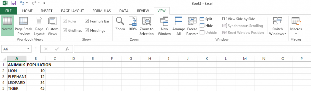
For creating a pie chart you first need to enter a set of data in the Excel Spreadsheet. Type the names of all categories in one cell range and the value associated with them in the other cell range just in front of the related categories.
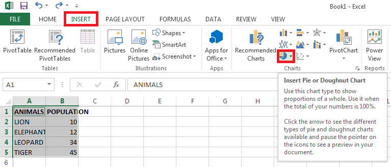
For example, we are writing the name of animals found in an area and their population in the other category. See the image below for better understanding:
Step #2: Select all the necessary data.
Once you have entered the necessary categories and their values, you’ll need to select them. Just use your mouse and select all the cells you want to use in your Excel Pie Chart.
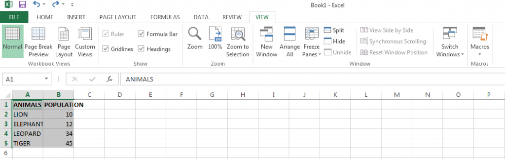
Note that you should not leave any line blank while writing the data.
Step #3: Adding the pie chart.
Once you have entered and selected the values, now it’s time to add the much-awaited pie chart. Click on the Insert tab and choose ‘Pie’ from the options that appear.
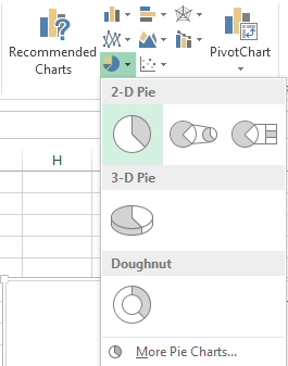
Once you click on it, a new pop-up will appear, it will contain all the styles you can use for your pie chart. From there select your pie chart. For this example, we are selecting the 2D pie chart which is the first option from the pop-up.
Congrats that’s all you have to do. Your pie chart will now automatically appear in the Spreadsheet as seen in the below picture.
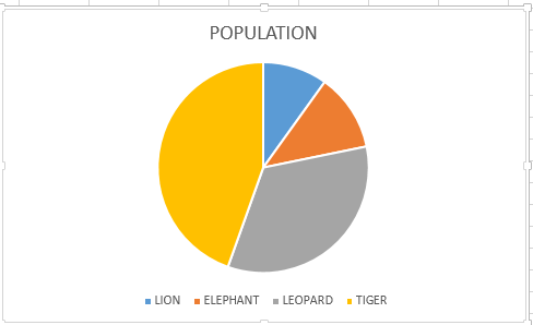
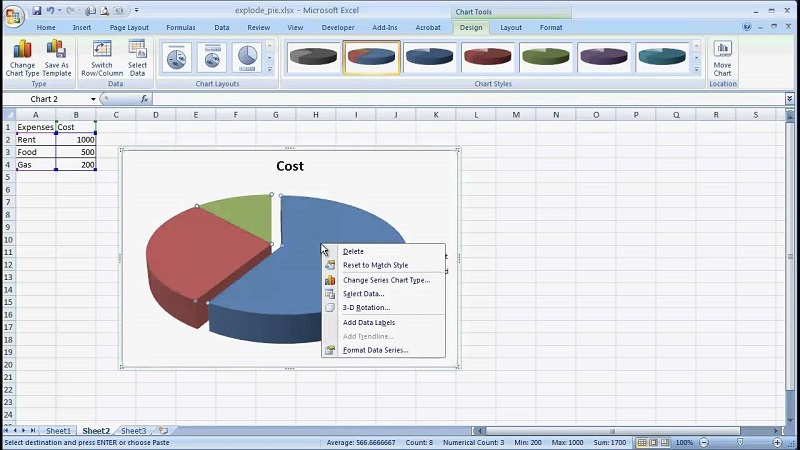
Now if you like, you can play with your pie chart. You can click on any slice of the pie and then take it away from the chart. This will be very helpful while giving a presentation. You can take the slice out of the circle which you are trying to explain. So people will easily understand which slice you are talking about.
Wrap up
So this was the complete tutorial on how to create a pie chart in Excel? Do you still have any questions in your mind? Do tell us in the comment box.
Stay tuned and thank you for giving it a read.